Archives

2007 Netflix Help Center Redesign

2007 Netflix Help Center Redesign

How we helped a burgeoning DVD rental company through a rough patch

Netflix faced a critical challenge – a disparity between the overwhelming demand on its customer support phone lines and the underutilization of its online help center. Recognizing the urgency of aligning these channels with evolving user expectations, Netflix embarked on a strategic journey to enhance operational efficiency and elevate the overall user experience. That’s where we came in.

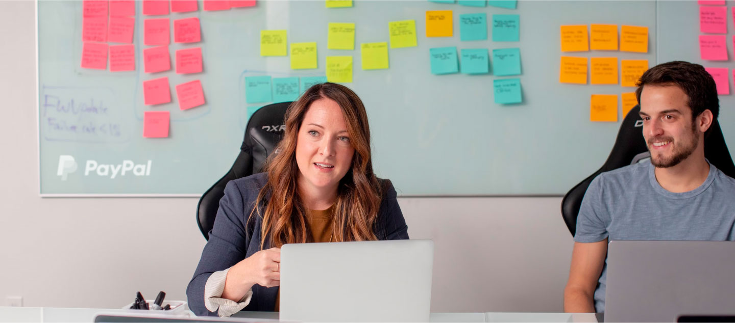
I’ve been working with Nyquist Design for over a decade now. They’re amazing partners – from product ideation, to visual design, to user experience research, to interactive design. Highly focused and committed to our success, Nyquist design has been the most important partner I’ve worked with in product development.

Vikram Subramaniam

Customer Experience & Product Management, Netflix

The Problem

Netflix grappled with a dual challenge impacting its operational efficiency and user satisfaction. On one front, customer support phone lines were overwhelmed, escalating operational costs and leading to prolonged wait times for users. Simultaneously, the online help center designed for user self-service remained significantly underutilized, indicating a misalignment between user needs and the digital support infrastructure.

Evolving user expectations for instant solutions in the digital age further exacerbated the issue. This imbalance risked creating a perception of inadequate support, threatening customer satisfaction and loyalty. Recognizing the urgency, Netflix sought a strategic solution to harmonize customer support channels and enhance the user experience.

The Process

To address this issue, a comprehensive approach was taken. Thorough research was conducted on other leading help centers, supplemented by a deep dive into heaps of qualitative and quantitative call center data. This analysis identified the shortcomings of the current website. The findings were then processed through personas and journey mapping, guiding the design of a help center that genuinely met customer needs.

The Solution

The research uncovered a key insight – the majority of customer issues prompting phone calls could be resolved by enhancing the design of the online help center. Collaborating closely with Netflix, we undertook the task of redesigning the online help center to effectively reduce the volume of calls to the customer support phone lines.

The Results:

The implementation of the redesigned online help center yielded remarkable and tangible results. There was a notable 15% reduction in call center volume, translating to a substantial annual cost savings of $15.6 million for Netflix. This success not only alleviated the strain on customer support operations but also significantly improved the overall customer experience.

By empowering users to find answers independently, Netflix not only reduced operational costs but also fostered a sense of empowerment and satisfaction among its customer base. This case study underscores the importance of a holistic and user-centered design approach in addressing operational challenges and delivering substantial business benefits.

15% reduction in call center volume, translating to a substantial annual cost savings of $15.6 million for Netflix

Vonage Developer Website Design

Vonage Developer Website Design

Vonage, once a world-renowned telephony company, lives on today as a top player in the communications API space. In an ongoing cycle of user interviews, and design refinement, we worked with them to redesign their developer website, which was a big success, both internally and externally.

The Problem

In the dynamic landscape of the communications API sector, Vonage encountered a mounting challenge as competitors such as Twilio, Pilvo, and Commio aggressively encroached on their market share. The urgency to maintain a competitive edge became paramount. Vonage had initiated a pivotal developer portal redesign to fortify their position and engage more effectively with their user base. However, this strategic endeavor faced a critical setback as key design leadership departed mid-initiative, leaving a void in the crucial alignment between company leadership and the internal design team.

Recognizing the pivotal need to navigate this intricate terrain, Vonage sought external expertise to serve as a Senior Design Manager. The mission was clear: bridge the gap, guide the internal design team, and ensure the seamless execution of the developer platform redesign. This challenge became a defining moment, requiring a strategic alliance between company leadership, the design team, and us and the external experts to chart a course that would not only counter competitive threats but also elevate Vonage’s standing in the communications API arena.

The Process

Embracing the role of Senior Design Manager, we embarked on a collaborative journey with Vonage’s internal design team. The process commenced with comprehensive research, delving into user interviews and subject matter expert discussions. These insights laid the foundation for the creation of User Personas and Journey maps, providing a holistic understanding of the user experience landscape.

Confident in our general approach and direction, we advanced to the design and prototyping phase. Solutions were meticulously crafted, bearing in mind the insights gleaned from research. To validate and enhance the design, four rounds of testing with customers and potential users were conducted. Each testing cycle brought forth valuable feedback, steering the design towards a more refined and user-centric iteration.

Journey Map

User Testing Map/Miro board

User Testing Analysis

The Solution

The culmination of this exhaustive process resulted in a powerful developer site, intricately designed and extensively tested to meet the evolving needs of Vonage’s user base. Desktop layout took precedence in the design, aligning with research indicating prevalent desktop usage among developers. The iterative design process, incorporating personas, journey maps, wireframes, and prototypes, was instrumental in shaping the final product.

The Results:

Vonage witnessed a transformative impact, marked by a 23% surge in sign-ups and an 18% increase in first-time account funding. The strategic redesign not only fortified their position in the communications API space but also solidified relationships with developers, positioning Vonage for sustained success in a fiercely competitive landscape.

The case study exemplifies the power of strategic design management in overcoming complex challenges, ensuring the seamless execution of critical initiatives, and driving tangible results in a competitive business landscape.

23% Surge in sign-ups and an 18% increase in first-time account funding

PayPal Cockpit UX/UI

PayPal Cockpit UX/UI

In order to move forward with confidence, you need a clear view of where you are and where you’ve been. Long-time client, PayPal, took this idea to a new level when they hired us to design the user experience and interface for their business cockpit. This graphical display of business metrics provides PayPal executives with the insight they need to steer the company to success.

“Without a doubt, working with Nyquist Design is a professional experience. Through the various projects I have worked on with them, their team have always gone above and beyond to produce and deliver outstanding creative work. They put emphasis on punctual delivery, while still being flexible to last minute changes. Plus, they’re fun to work with!”

Laura Ward

Principal, Design & Discovery, PayPal

The Problem

PayPal faced a multifaceted challenge demanding a nuanced solution. The need for an internal tool was critical, stemming from a desire for comprehensive business insights at every echelon of the organization. The executive team, navigating the complexities of strategic initiatives, yearned for real-time Key Performance Indicators (KPIs) to bolster decision-making. Simultaneously, managers sought a robust project tracking mechanism, craving visibility into ongoing endeavors. Delving deeper, individual contributors grappled with a lack of clarity regarding task expectations, yearning for a cohesive understanding of their role within the broader organizational context.

This intricate tapestry of challenges underscored the necessity for an internal tool that not only bridged the information gap but seamlessly catered to the diverse needs of leadership, management, and individual contributors. The absence of such a tool created a void in organizational cohesion, hindering effective communication and alignment across all levels. Addressing these multifaceted needs required a meticulous exploration of each stakeholder’s perspective, highlighting the complexity inherent in delivering a solution that would truly transform how PayPal operated internally.

The Process

In collaboration with subject matter experts (SMEs) from various departments, we conducted a thorough analysis to determine the most valuable information and its interrelation across different groups. Researching third-party tools, APIs, and data sources, we aimed to leverage existing resources for enhanced insights. The use of personas, journey maps, wireframes, and prototypes guided us toward the final design that addressed diverse organizational needs.

The Solution

The culmination of this exhaustive process resulted in a powerful internal website that served as a strategic hub for business insights. Tailored for product managers, it facilitated the alignment of Objectives and Key Results (OKRs) with initiatives, enabling the planning of quarterly roadmaps, the meticulous tracking of progress, and more. The platform went beyond mere project tracking; it provided a dynamic visualization of productivity, fostering a holistic understanding of ongoing efforts.

The Results:

This comprehensive internal website brought about a paradigm shift in how PayPal operated internally. The leadership team gained heightened top-level visibility, enabling informed decision-making and accurate forecasting. Managers found a robust tool to set clear expectations and monitor project status in real-time.

For individual contributors, the platform provided a contextual lens, allowing them to see their tasks in relation to the broader organizational picture, fostering a sense of purpose and alignment. The transformative impact rippled across all levels, creating a more cohesive, informed, and agile organizational culture within PayPal.

CyberRes Ransomware Whitepaper

CyberRes Ransomware Whitepaper

CyberRes hired us to design their 250 page white paper. This was a large editorial layout project. They liked the outcome so much that they hired us to design another for them!

SAP Microsite Design

SAP Microsite Design

We worked closely with both SAP and their marketing agency, Aventi Group,  to design a series of microsites that would showcase their products and services in a visually engaging and informative way. Our team conducted extensive research to gain a deep understanding of SAP’s target audience and their needs, and used this information to create a user-centered design approach. The resulting microsites were optimized for performance, accessibility, and user experience, and received positive feedback from both SAP and their customers.

Adobe Article Imagery

Adobe Article Imagery

In our line of work, we’re no stranger to the Adobe website. That’s why it was such an honor when Adobe hired us to create visuals for the educational content on their site. We created over 80 images to accompany articles about their various applications. Each image illustrated different tools and features, such as scale, contrast, warp, etc.

SAP Presentation Design

SAP Presentation Design

We regularly design presentations for SAP. They come to us with a rough deck, and within a quick turnaround, we polish it, clean up the visuals and messaging as needed. This is one example of that effort.

Plumbtree Plumbing Branding and Website Design

CyberRes Ransomware Whitepaper

When plumber extraordinaire, Glenn Hammonds, decided to set out on his own, he knew who to call about getting set up with a world class logo, website, and overall brand. We designed the all of it hand-in-hand with him, and he couldn’t be happier with how it turned out!

PayPal Multi-Currency Animation

PayPal Multi-Currency

PayPal hired us to produce an explainer animation that illustrated the functionality and benefits of their multi-currency website plug-in (which we also designed). Our roles in this animation project were script writing, storyboarding, voiceover recording, music selection, visuals design, and animation.

Sling AirTV Animations

Sling AirTV Animations

Sling hired us to produce an explainer video to help their target audience understand how their AirTV product works. We animated three different videos for use in their website, social channels, and in-store marketing.

“Nyquist Design has consistently done outstanding animation work for several high-profile clients I’ve worked with over the past several years. Their work is not only highly creative and eye-catching, but their creative ability is exceptional with great focus on superb storytelling.”

Mark Vena

Worldwide Vice President of Marketing, Sling Media